Image of two posters hanging on a dark gray wall. Both posters are beige with "Salty" in big blue type and illustrations.

Salty Branding

Modern Species

Year
2018

Deliverables
Posters
Postcards
Coasters
Illustration / icon design

What does ‘salty’ look like?

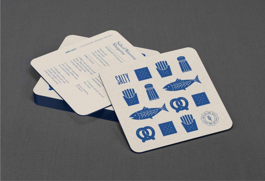
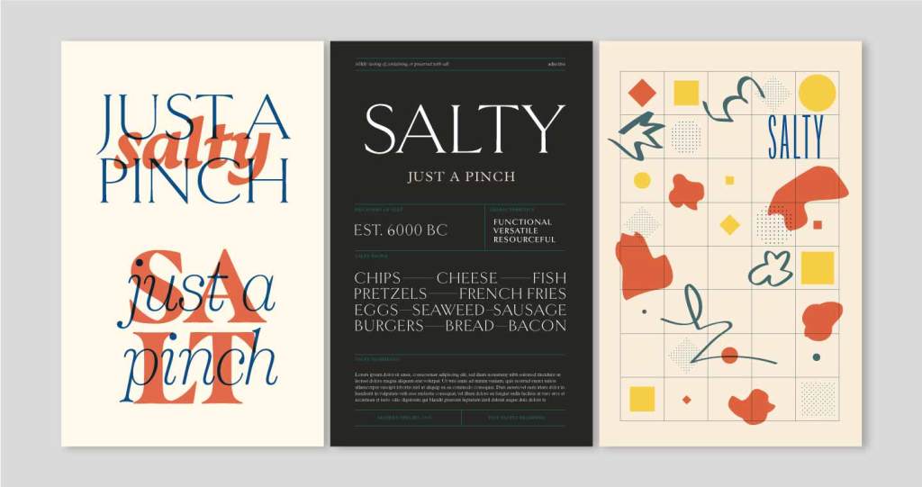
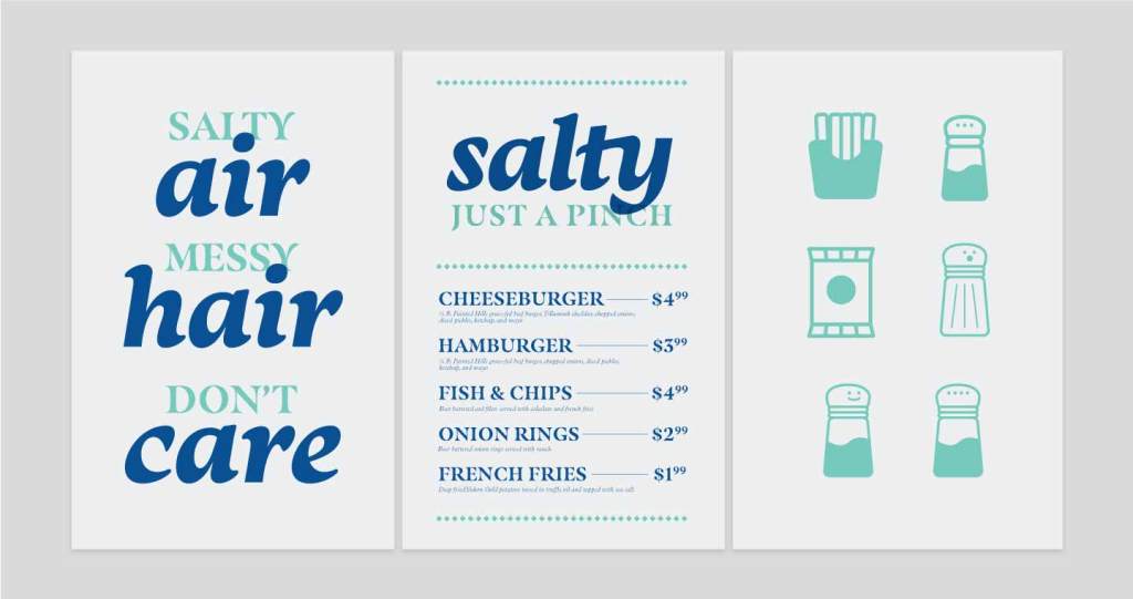
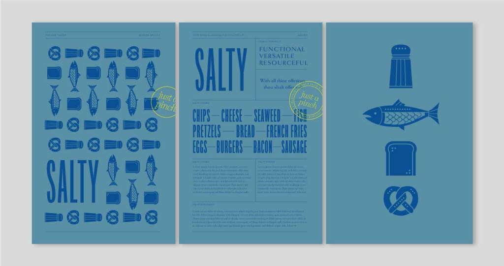
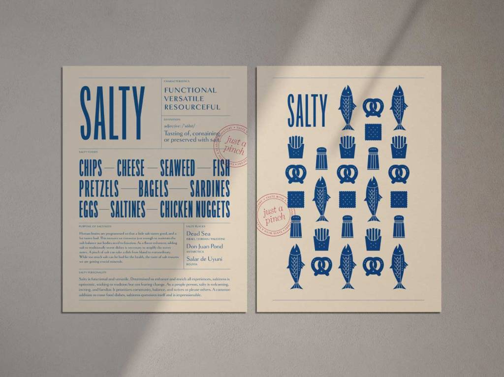
The Good Taste project was an internal Modern Species project to challenge ourselves to make taste visual, and create a brand for one of the six tastes: bitter, salty, sweet, umami, sour, and spicy. Tasked with salty, I created a brand that captures the best qualities of saltiness: it’s accessible, honest, functional, and versatile. With simple illustrations and bold typography, the brand infuses the legacy of salt the mineral and the ubiquitousness of salt the condiment, resulting in a no-nonsense look that’s as utilitarian as table salt.

Image of brown text on a beige background with a red stamp on the lower right corner that reads "just a pinch" in the center and "taste with a seasoned history" on the outer circumference. The brown text is lines of tall capital letters that reads "Chips" "Cheese" "Seaweed' "Fish" "Pretzels" "Bread" "French Fries" "Eggs" "Burgers" "Bacon" "Sausage" "Prosciutto" "Halloumi" "Pizza" "Chicken Nuggets' and "Tortilla Chips" with a short horizontal line separating each phrase.
Image of a pile of beige coasters on a dark gray background. The top 2 coasters are askew, with the top showing a patterned illustration of fish, french fries, salt shaker, saltines, and the Salty logo. The bottom coaster shows a recipe for a salted watermelon margarita.
Image of three phrases on a dark blue background. The left phrase reads "Stay Salty", the middle phrase reads "Salt Lovers Club", and the right phrase reads "Team Salt".
Close up image of the Salty patterned illustration. The top row is an illustration of french fries in a paper carrier, a salt shaker, and a fish. The bottom row is the same fish, a pretzel, and a saltine cracker.
Image of two framed beige posters on a concrete background. The left poster reads "Taste with a Seasoned History" with a red stamp on it, and the right poster shows the Salty illustration pattern with a big "Salty" logo at the bottom.

Initial Concepts & Explorations

  • Image of 3 posters showing different options for the Salty Brand. The left poster is beige that shows two version of the phrase "Just a pinch" with "Salty" and "salt" overlaid in the background. The middle poster is dark gray that reads "salty" in big type and "just a pinch" below it. It is gridded with different blocks of type laid out. The right poster shows a variety of shapes and illustrations in a grid.
  • Image of 3 posters on a light gray background. The left poster reads "salty air, messy hair, don't care", the middle poster reads "salty, just a pinch" with a food menu below it, and the right poster shows 6 illustrations: a carton of french fries, a packet of chips, and 4 variations of salt shakers.
  • Image of 3 blue posters on a light gray background that look most similar to the final salty branding. The left poster shows the patterned illustration, the middle poster shows the gridded type layout, and the right poster shows a close up of 4 illustrations: salt shaker, fish, bread, and a pretzel.